Design
Estimated Timeline
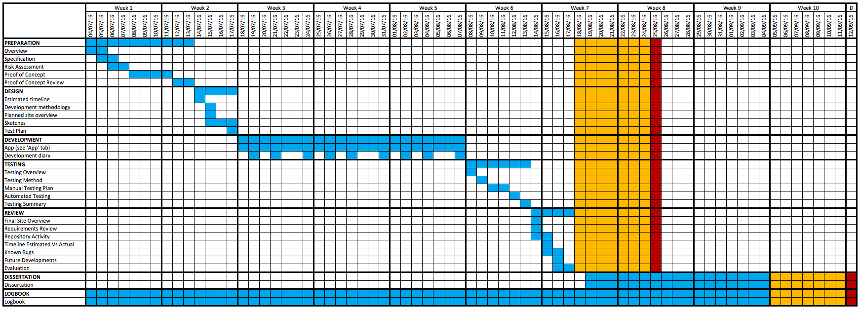
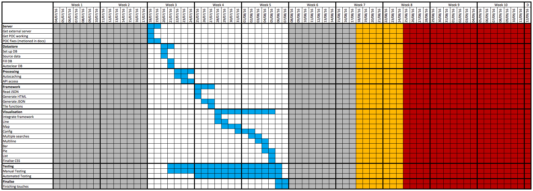
A couple of Gantt charts have been created to show the estimated timeline for the completion of each section and subsection of the project.
Key:
- The blue cells indicate the expected day that section of the project would be worked on.
- The yellow cells are planned as contingency, if any problems arise this time can be used without affecting the timeline.
- The red cells show the final deadline for submission of each section of work.
Below is a Gantt chart for the whole project:
(Open the image in a new tab to view it larger.)
Below is a Gantt chart for the application development:
(Open the image in a new tab to view it larger.)
Development Methodology
This project will be completed using an agile development methodology, but because this project is being completed by a single developer, some practices that would occur within a team working using an agile development methodology become redundant. In short, agile software development is focused on providing early feedback, and frequent releases of the project.
Because I am solo developing this application, I will split the application into four separate sections to be implemented, I will then combine each of them to create the complete application. This will be beneficial to the development of the application as it enables me to focus on a specific part of the application and then put them together as they are purposely being developed as a modular design.
The application will be developed in the following order:
- Visualisation manager - JSON configurations
- Tweet processing
- Data store interaction
- Visualisations - Web application
Planned Site Overview
Below is a diagram showing an overview of the data flow of the system:
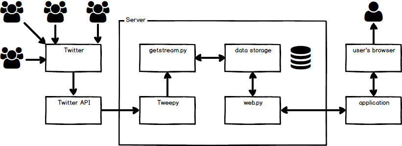
Thousands of users are constantly posting to Twitter, Twitter allows access to this data through their API.
The Python Tweepy library then receives data from Twitter's streaming API; whenever a tweet is received the 'getstream.py' script processes and stores the required tweet data.
When a user of this application attempts to access the application, the web.py script returns the files and data that is required for them to view the application (as shown in more detail below).
Planned Browser - Server Interaction
Below is a diagram showing the interactions required between the server and the user's browser to make the application run:
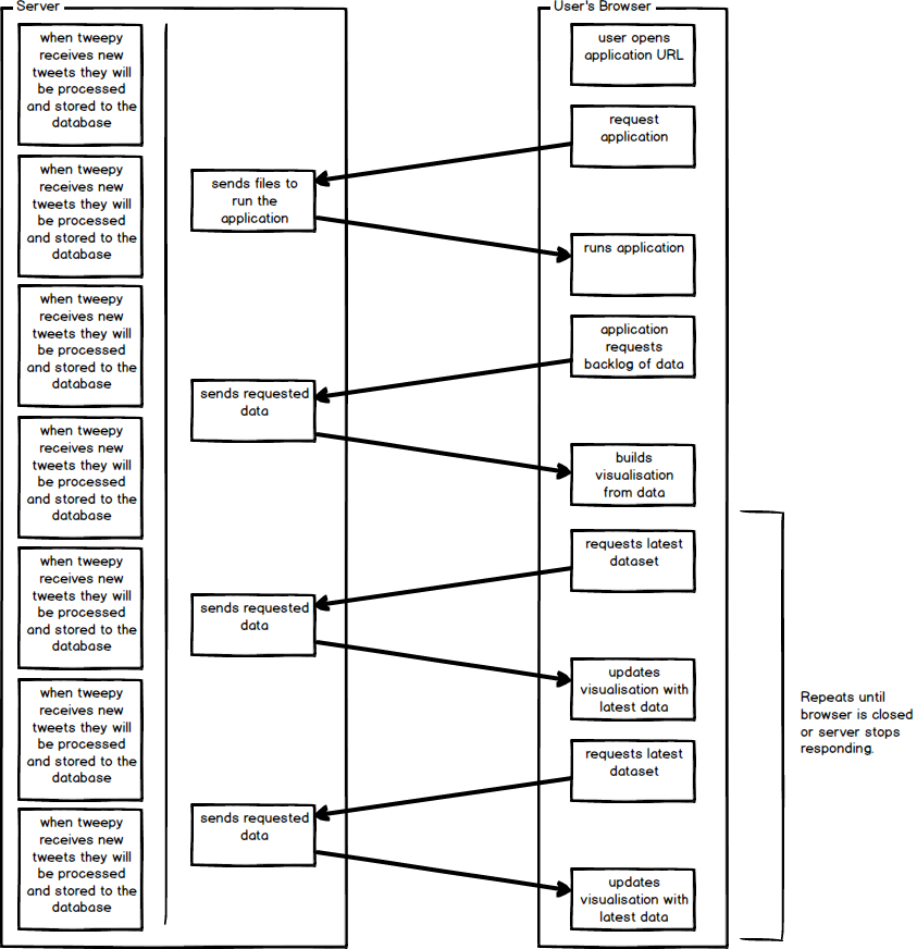
The server continuously acts upon new tweets that are received from Tweepy (the Python Twitter API), processing and then storing the relevant information into the database on the server.
When the user attempts to access the application their browser will request the application, and the server will respond sending all of the required files to load the application. This includes the HTML, JavaScript, CSS as well as the JSON configuration (that can be changed on the settings / import page).
Within the JS that is being run in the browser, a request to the server is made for a backlog of all of the data for the specific search term that has been collected within the time duration selected on the dashboard.
The server then sends the requested data to the JavaScript, which will then process the data and produce the completed visualisation(s). Within this JavaScript there is also a request to receive the latest data from the database so that it can update the visualisations that are displayed.
The JavaScript in the user's browser will continuously request the latest data from the server, and then update the visualisations until the web page is closed.
Sketches
When sketching out plans of each of the pages, hand drawn sketches were created. These sketches were then digitised with a few minor alterations using 'Balsamiq Mockups 3'. They were digitised because for me, it is much quicker to confirm which features are yet to be implemented. The digitised sketches have been included below (the hand drawn sketches are in the logbook).
Sketch of the visualisation page:
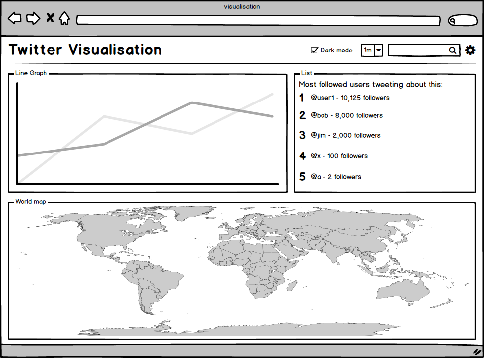
This sketch shows a possible configuration of the main page of the application.
The top row of the page is the header, on the right of the header are some configuration options. There is a 'dark mode' checkbox which switches the page's css between daytime styling and night-time styling (dark grey / black background with other styling to match). To the right, there is a combo box (drop down box) with the text '1m' selected inside; this is used to select the duration of the data shown on the graphs, '1m' will use the last minute of data. Changing this value will reload the page using a new duration. Next there is a search box; using this will change the search filter used on the twitter data. And finally there is a cog that links to the settings page.
Below the header there are three different sections, a line graph, a top five list, and a world map. The data streams used to generate each of the sections do not have to be the same. The countries on the world map will be coloured to produce a heat map which will show the quantity of a specified data stream per location.
Below is a sketch of the settings page:
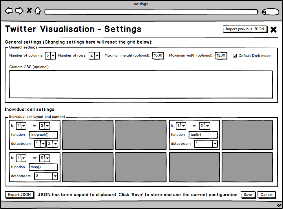
In the header there are two buttons, the first will redirect the user to the import JSON page, the cross icon takes the user back to the visualisation page.
The first section of the main page is where the user can enter the 'General Settings' for the configuration. Here they set the number of columns, rows, and whether they want dark mode enabled by default as well as optional height width and extra custom CSS if they wish to.
The second section is where the user can set up the visualisations in the individual cells of the page. If a single visualisation needs to take up multiple cells (in a rectangular shape) then the additional cells will be blanked out. Here the user can set the height, width, function and data steam(s) used to create each of the visualisations.
Once the configuration is complete, the user can export the JSON to the clipboard, as well as either save or cancel the changes by using the 'Save' or 'Cancel' buttons.
Below is a sketch of the import page:
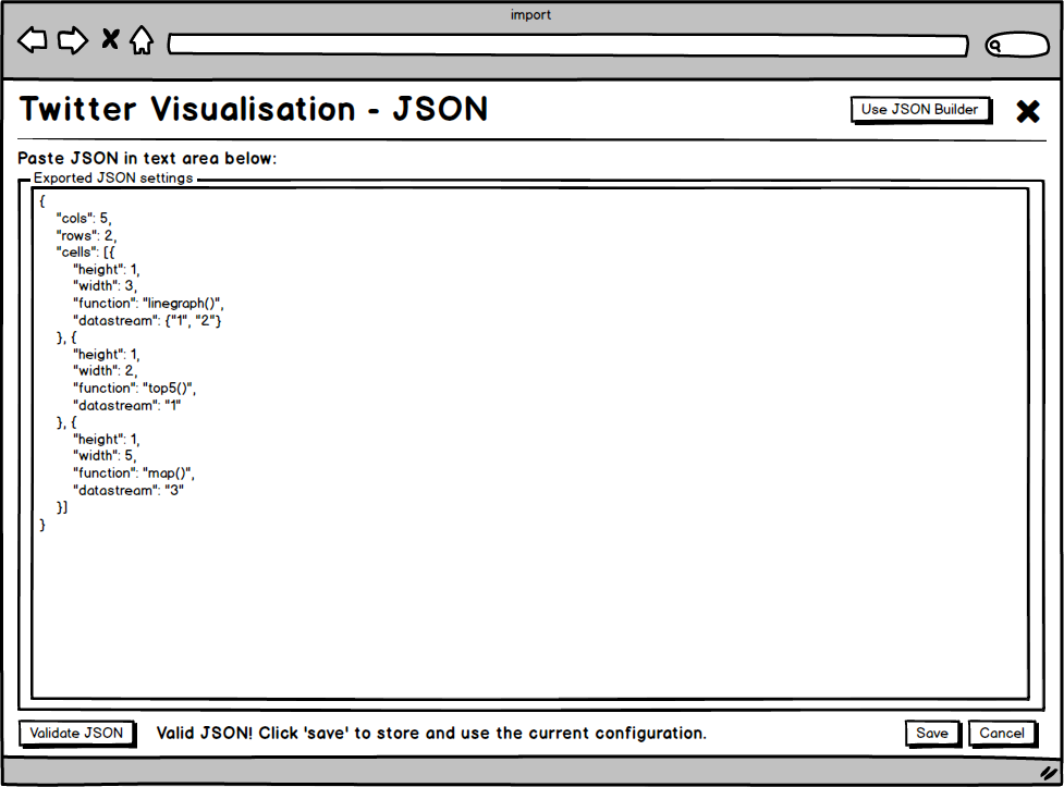
In the header there are two buttons, the first will redirect the user to the settings page, the cross icon takes the user back to the visualisation page.
Below the header there is a large text area to paste a previous JSON configuration into. Then below that there is a 'Validate JSON' button to check that the entered JSON is valid. And to the right of that there is the option of either saving or cancelling the proposed configuration using either the 'Save' or 'Cancel' buttons.
Database Configuration
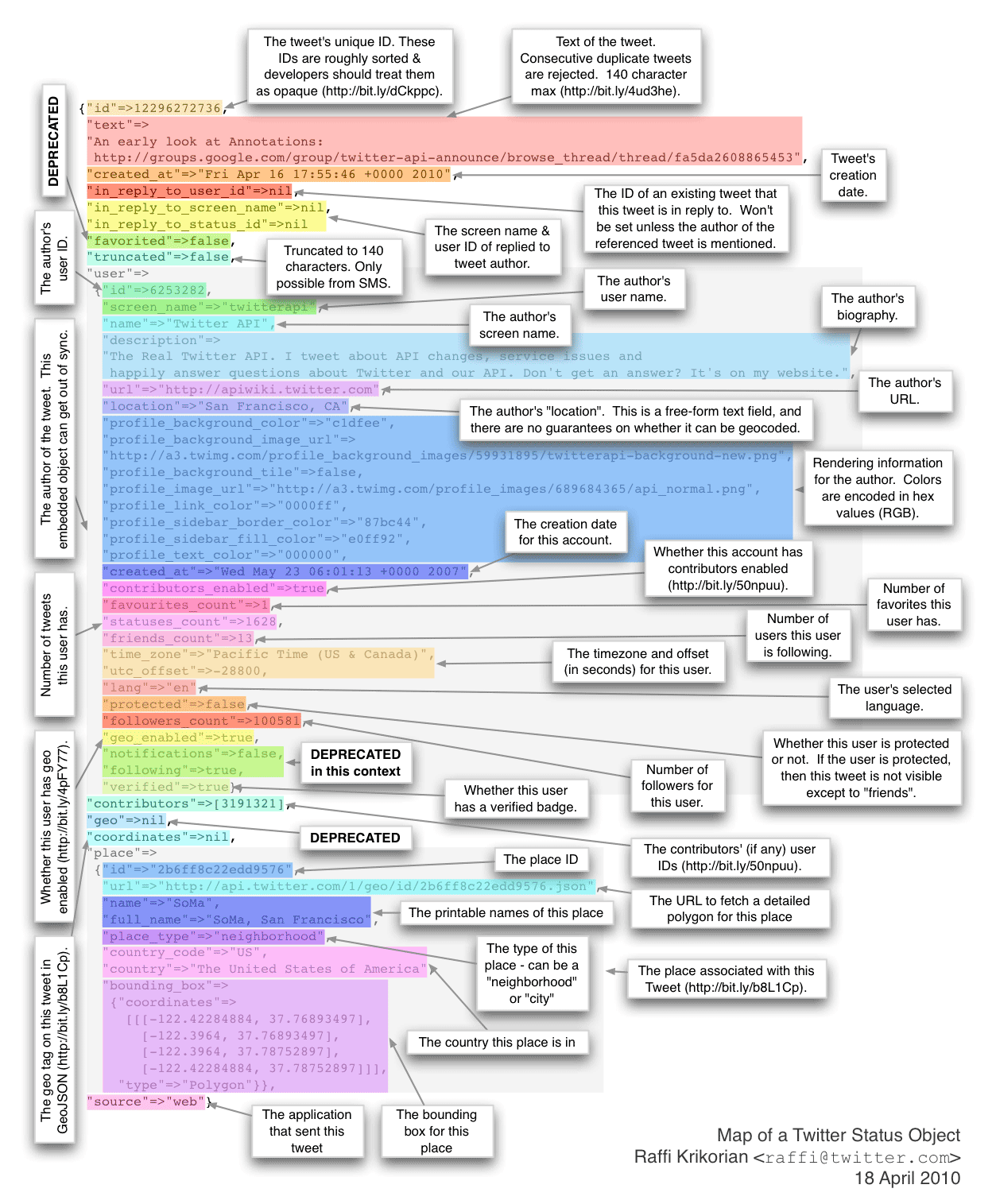
As you can see in the image below, taken from this blog post, there is a huge amount of data received with each tweet. (Image not fully up to date with the current API.) A subset of this data will be processed and stored in a database on the server.
Database Structure
The list of fields in the proposed database is as follows:
| Name | Type | Description |
|---|---|---|
| id | integer | A unique auto generated field to use as the primary key. |
| created_at | datetime | The time and date of when the tweet was posted. |
| text | varchar | The contents of the tweet. |
| search | varchar | The search term in use when the tweet was received. |
| country | varchar | The country from which the tweet was posted. (Getting this data is complicated). |
| reply | boolean | Whether the tweet is a reply or an original post. Replies will be stored as true. |
| source | varchar | The application where the tweet was posted from, e.g. 'Twitter for iPhone'. |
| u_name | varchar | The username of the author of the tweet. |
| u_created_at | varchar | The time and date of when the account was created. |
| u_favs | integer | The number of favourites that this user has. |
| u_status | integer | The number of tweets that this user has posted. |
| u_friends | integer | The number of accounts that this user is following. |
| u_followers | integer | The number of users that are following this account. |
| utc_offset | varchar | The utc offset of the user. |
| verified | boolean | Whether the user is verified or not. Verified users will be stored as true. |
Test Plan
There are four main sections of the application being developed that need to be tested:
- Tweet processing
- Data store interaction
- Visualisation manager - JSON configurations
- Visualisations - Web application
Tweet processing
By fabricating fake tweets or using previous tweet data that the system has received it will be very simple to test the tweet processing using unit tests. Providing unit tests are created that test all the required functionality it will be very simple to ensure that any changes that are made to the repository do not affect the outcome of the tweet processing in a negative way, and that any changes that break the system can be reported instantly.
Data store interaction
In the same way that tweet processing should be tested using unit tests, data store interaction should also be tested in this way. It is very time efficient to test database interaction using unit tests; after the initial time has been spent writing the tests, every modification to the database handler code should not compromise the way that the CRUD (Create, Read, Update, Delete) operations work.
Visualisation manager - JSON configurations
Because of how many different ways that the JSON configurations could be invalid, it is essential that it is subjected to a comprehensive set of unit tests, testing all the different ways that the JSON could be invalid every time the code was updated would take far too much time. There will also be a large amount of regression testing to ensure that both the input and output of the visualisation manager page works as expected. These regression tests will be written as the manager page is written to ensure that important stages are not missed out.
Visualisations - Web application
Due to the nature of the web applications, and visualisations in particular, beyond testing whether they have simply loaded and updated when new data has been received, there is not much else that could be easily tested using unit tests, without spending an excessive amount of time to carefully write the tests. Because of this, the majority of the front end testing will be completed using regression testing. The list of regression tests will be created as the development of the application progresses.
Summary
In summary, the tweet processing, data store interaction and visualisation manager code will all be tested using unit tests. The visualisation manager will also be subjected to regression testing alongside the rest of the web application.