User Guide
Welcome to the User Guide for Raven, a Twitter visualisation created to display highly dynamic network data.
Introduction
Raven was created by Matt Weeks (matt@weeks.codes) for his Masters dissertation project.
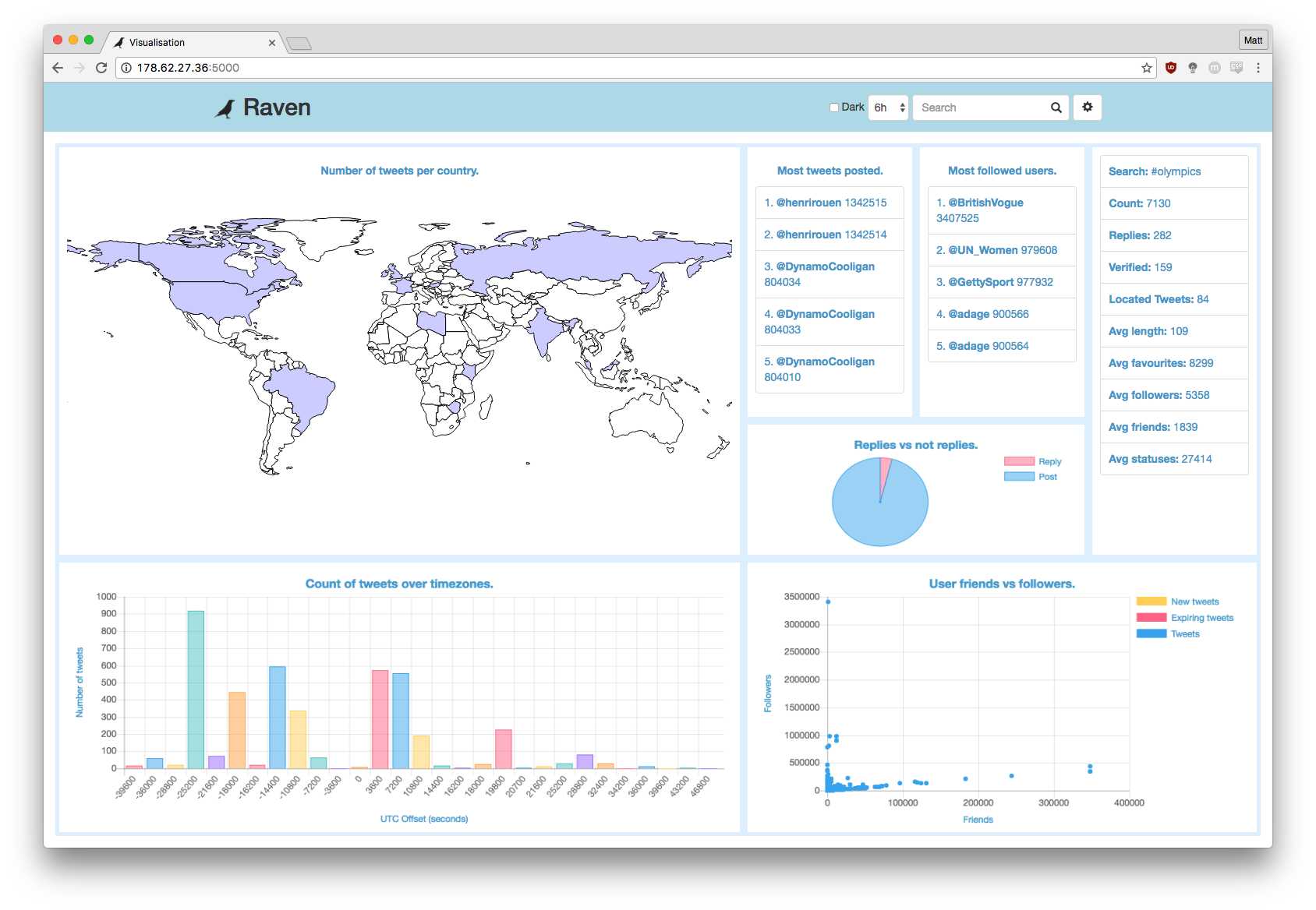
The aim of this application was to visualise extremely dynamic data to be able to easily see useful information from the vast amount of data that is being produced. It has been implemented to work with data accessable from Twitter's API.
As shown in the screenshot above, there are a number of different visualisations available for the user to be able to visualise the data.
Throughout this User Guide you will learn how to set up and use this application on your own server.
Install Guide
The source code in the 'masters-source' repository has been provided within a vagrant box making it fairly simple to get the application up and running.
Setup(Mac):
-
Install VirtualBox and Vagrant
-
Clone this repository (if you need to download the repository from GitHub).
git clone https://github.com/maweeks/masters-source.git -
Open the terminal application
-
Navigate inside the cloned repository, into the vagrant folder.
cd [REPOSITORY_LOCATION]/masters-source/vagrant -
Start up and connect to the vagrant machine using the following command:
vagrant up; vagrant ssh; -
Open create a 'secrets.py' file using 'secrets.template.py' filling in your information.
-
Set up the database and run the web server using the following command:
cd /vagrant/twitterviz/; rm store/twitterData.db; python database_setup.py; python web.py; -
Open another terminal window, navigate to the same directory and then run:
python getstream.pyThe application is now set up and ready to be used.
-
Visit the following address to use the application.
localhost:5000
NOTE 1: If step 7 or 8 fail it is likely that some required python libraries are not installed, install these and then continue.
NOTE 2: Both 'web.py' and 'getstream.py' must run at the same time. One creates the webserver, the other gets the tweet data from twitter.
NOTE 3: You MUST get valid credentials for each of the services required and save them in 'secrets.py'. The application will not work without these.
Application Usage
There are three pages that make up this application:
-
Settings - set up the application configuration.
-
Import - use an old application configuration.
-
Visualisation - the page to view and interact with the visualisation.
Below, each page will be explained so that you know exactly how each element on the page affects the application. The currently available function and datastream pairings will also be listed.
Settings
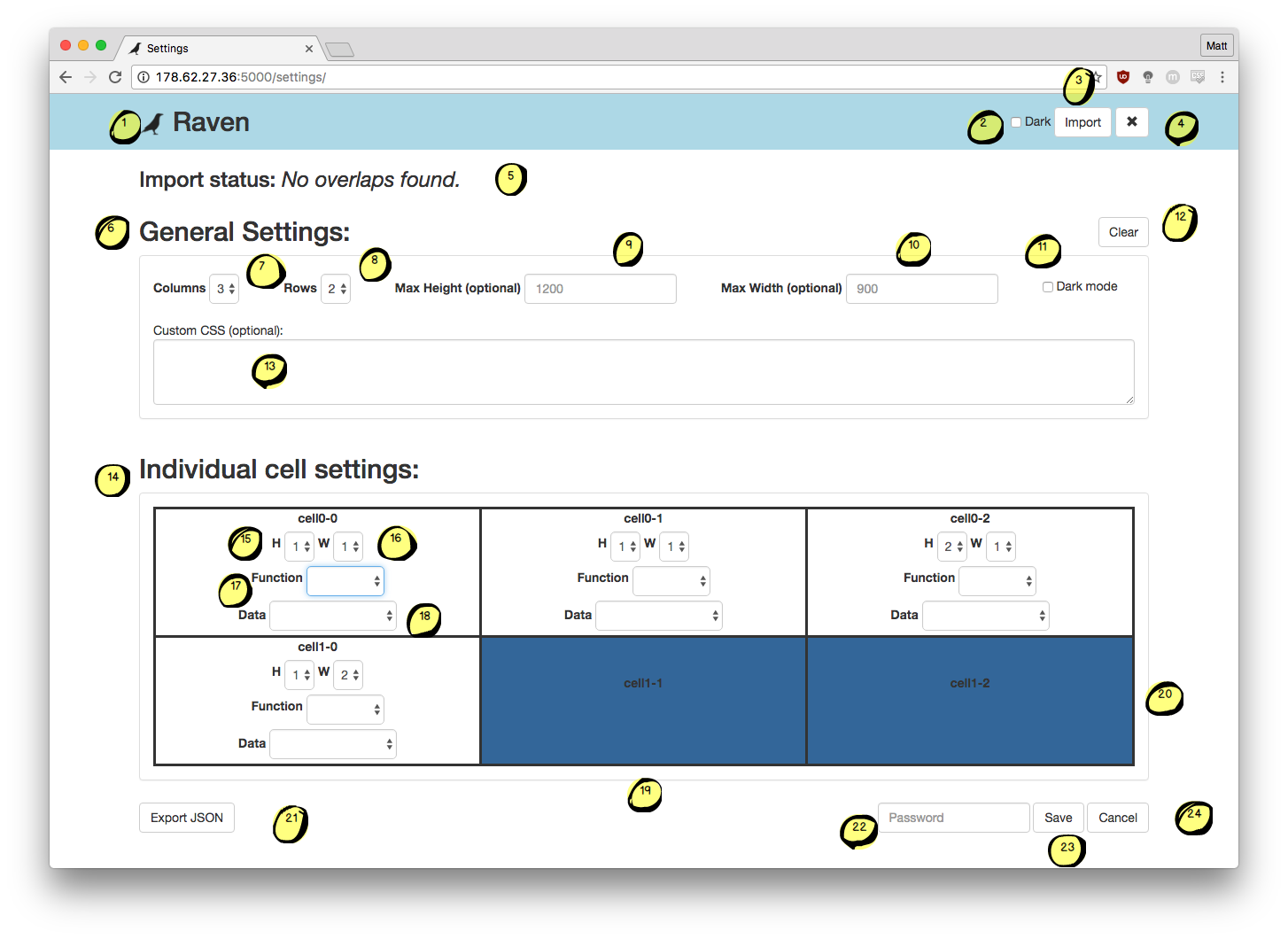
This page should be used to configure the visualisation that will be shown on the main page of the application.
-
The icon and name of the application, links to the visualisation page if clicked.
-
'Dark mode' selector, if checked then the CSS styling of the page will turn darker, designed to reduce the damage of using screens in the dark.
-
A link to the 'import' page.
-
A link to the 'visualisation' page.
-
Status message box, will update to explain the status of the current operation.
-
General settings, where the overall layout of the page is set.
-
Select the number of columns in the visualisation.
-
Select the number of rows in the visualisation.
-
Set the maximum height of the applicatioin (optional - will fill height if left empty).
-
Set the maximum width of the applicatioin (optional - will fill width if left empty).
-
Default dark mode selector, if checked the application will load into dark mode.
-
Clear button, removes all information from both general settings and individual cell settings are started afresh.
-
Custom css text box, enter custom css here to truly customise your visualisations. WARNING: This could break the application layout.
-
Individual cell settings, where each visualisation is configured.
-
Selector for the number of cells high this visualisation will be.
-
Selector for the number of cells wide this visualisation will be.
-
Selector for the function to be run in this cell of the page.
-
Selector for the data steam to be used to populate this visualisation.
-
A merged cell, from the left, cell 'cell1-0' has a width of 2.
-
A merged cell, from the top, cell 'cell0-2' has a height of 2.
-
Export JSON button to copy the JSON required for the current content of the form.
-
A password text box to enter the password, required to save the configuration.
-
A save button, if clicked will check the JSON is valid and then save it if it is.
-
A cancel button to return to the application page.
Import
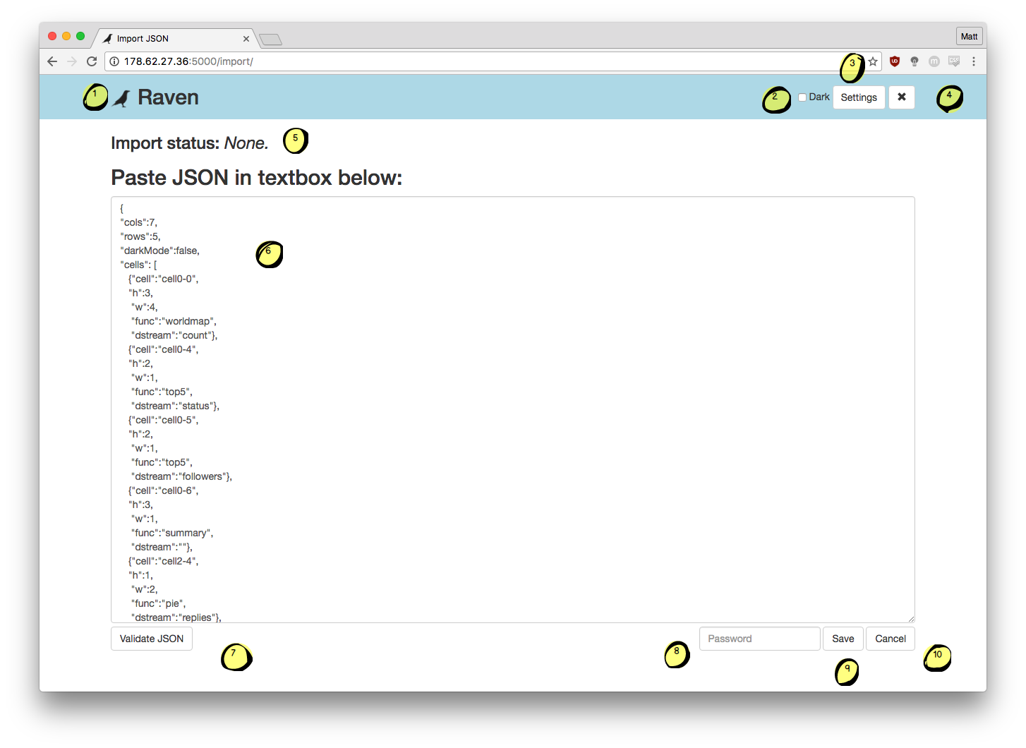
This page should be used to import previous configurations that were exported. It is not advised to write a custom configuration by hand.
-
The icon and name of the application, links to the visualisation page if clicked.
-
'Dark mode' selector, if checked then the CSS styling of the page will turn darker, designed to reduce the damage of using screens in the dark.
-
A link to the 'settings' page.
-
A link to the 'visualisation' page.
-
Status message box, will update to explain the status of the current operation.
-
The text area to paste your desired configuration into, then be able to save it.
-
A button to check if your configuration is valid before trying to save it.
-
A password text box to enter the password, required to save the configuration.
-
A save button, if clicked will check the JSON is valid and then save it if it is.
-
A cancel button to return to the application page.
Visualisation
-
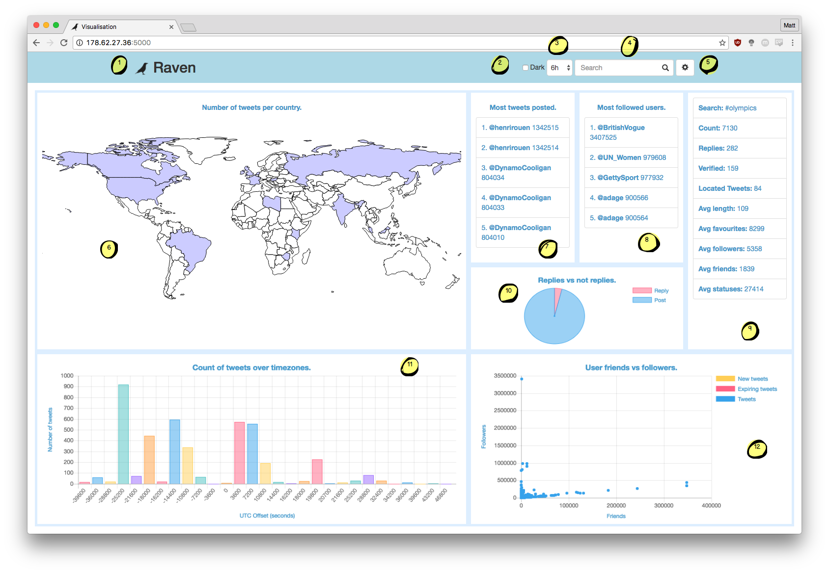
The icon and name of the application, links to the visualisation page if clicked.
-
'Dark mode' selector, if checked then the CSS styling of the page will turn darker, designed to reduce the damage of using screens in the dark.
-
A combo box selector to change the duration of the data shown within the visualisations.
-
A search box to change the current term being used to filter the Twitter data.
-
A link to the 'settings' page.
-
A world map heat map.
-
A 'top5' list.
-
A 'top5' list using a different metric.
-
The summary pane, shows off the statistics about the data behind the visualisations.
-
A pie chart of original posts versus replies.
-
A bar chart showing the number of tweets per utc offset.
-
A scatter graph showing friends versus followers. Yellow points are new and red points are about to expire.
Available functions:
- [blank] - leaves just the cell name in the cell and applies no styling.
- Data stream has no affect on this function.
- Data stream has no affect on this function.
- 'bar' - creates a bar chart within the cell.
- Must use 'utc'.
- Must use 'utc'.
- 'line' - creates a line chart within the cell.
- Must use 'count'.
- Must use 'count'.
- 'pie' - creates a pie chart within the cell.
- Can use 'replies' or 'verified'.
- Can use 'replies' or 'verified'.
- 'scatter' - creates a scatter chart within the cell.
- Can use 'friendsVsFollowers' or 'statusVsFollowers'.
- Can use 'friendsVsFollowers' or 'statusVsFollowers'.
- 'summary' - creates a statistics list within the cell.
- Data stream has no affect on this function.
- Data stream has no affect on this function.
- 'top5' - creates a five item list within the cell.
- Can use 'favourites', 'friends', 'followers' or 'status'.
- Can use 'favourites', 'friends', 'followers' or 'status'.
- 'worldmap' - creates a world heat map within the cell.
- Must use 'count'.
- Must use 'count'.
- 'redCell' - leaves just the cell name in the cell and applies a red background.
- Data stream has no affect on this function.
- Data stream has no affect on this function.
- 'blueCell' - leaves just the cell name in the cell and applies a blue background.
- Data stream has no affect on this function.
- Data stream has no affect on this function.
- 'greenCell' - leaves just the cell name in the cell and applies a green background.
- Data stream has no affect on this function.
F.A.Q.
Q: Why can't I save my configuration?
A: If the configuration fails to save or export it is because it is invalid. Make sure that you have no overlapping cells.
Q: I can't get any data from Twitter?
A: Make sure you have entered all of your configuration settings correctly in 'secrets.py' and check that Twitter's API is active.
Q: Why is the page styling all messed up?
A: If you are using custom styling or have small cell sizes for the visualisations the page may not look right. Either remove the custom styling or reduce the number of visualisations and your issues should be resolved.
Q: Why are my visualisations not loading?
A: Each of the visualisations have different available commands. Check the Application Usage section above to make sure you are using valid combinations of data and visualisations.
Q: Why is my custom styling not working?
A: All custom css gets added to a <style></style> block when the page loads. Make sure that the styling that you have entered is valid.
Q: Why is there no data on my visualisations?
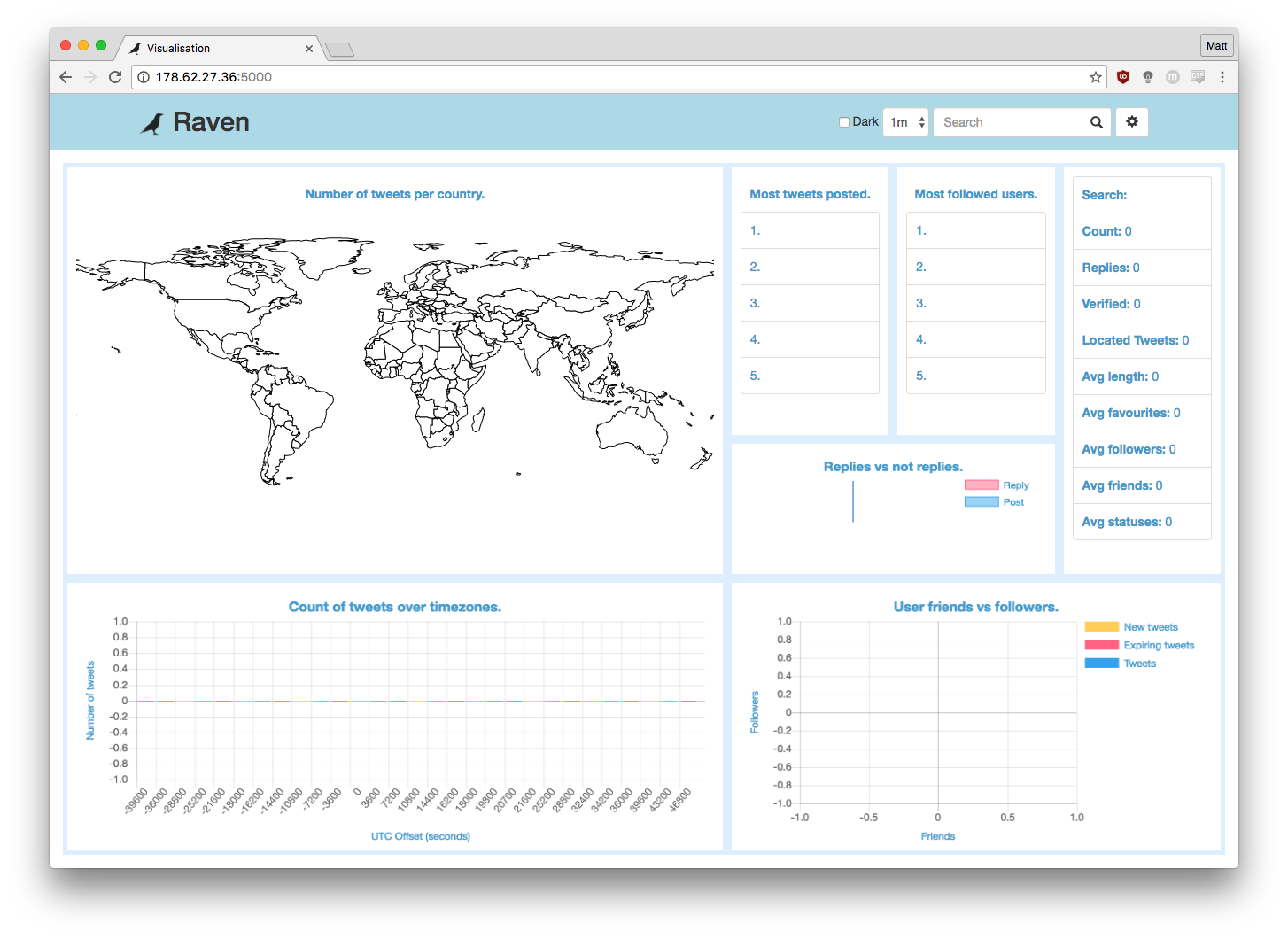
A: Make sure you have data being stored into the database with 'getstream.py', as without the Twitter data Raven has nothing to visualise. For example, the screenshot below has no data available to the visualisation.
Summary
This application was not designed and tested to the level that commercial software should be, there may be some bugs (or unintended features). Following the steps detailed within this guide it should definitely be possible to get the application running on your own server.
Contact
If you would like more information about this project contact Matt Weeks at either mjw77@kent.ac.uk or matt@weeks.codes.