Review
Final Site Overview
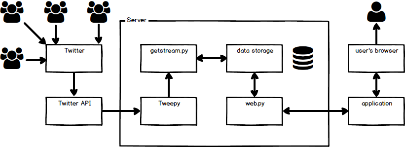
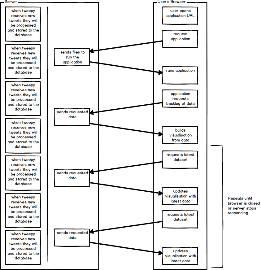
Both the final site overview and the browser server interaction ended up exactly as they were displayed in the diagrams in the 'Preparation' section. Throughout the development process it would have been easily possible to modify either of these, but they were precisely what was needed in terms of structuring the application.
Planned site overview
Planned browser server interaction
Requirements Review
| Requirement | Review |
|---|---|
| Overview | |
| An extremely dynamic data source must be used. | Twitter is an extremely dynamic data source. |
| The data must be processed in a meaningful way. | A number of graphs have been produced that process the large amount of Twitter data into an easy way to consume the information, such as the heatmap showing where the tweets originated. |
| A visualisation or multiple visualisations must be produced. | A number of visualisations have been produced. |
| The visualisations must maintain a view of the current data while also updating to show the newly collected data. | The user can select the duration of historical data kept within the visualisation so a set time period of data will be kept at all times. |
| Data collection | |
| Twitter's API will be used as the data source for this project. | Twitter's API was connected to by the Tweepy library. |
| A library will be used to connect to the API to reduce risk of issues connecting to the API both initially and if the API were to change. | Tweepy has been used to mitigate the issues that could arise from using third party services. |
| Any filters used when collecting the data from Twitter will be easily modifiable so that the content of the dashboard output can be easily adjusted as and when required. | The user can change the filter using the search box at the top of the visualisation page. |
| Data processing and storage | |
| Data collection and processing will be handled separately to ensure that data collection is not impacted by data processing. | Upon receiving the data it is put into a list of received data which will be processed and stored by another function. |
| The vast amount of data gathered will be processed to reduce the size of data storage whilst still managing to contain all data required for all visualisations that can be produced. | A number of fields have been removed, reducing the number of fields per tweet to fifteen. |
| The data will be stored in an efficient way, to ensure that excessive storage is not required to keep the application running. | The data is being stored in an SQL database with the best data types for each field. |
| Output | |
| All data used for the visualisation will be retrieved from the data store used within the application to ensure that the data collection from Twitter is not impacted by running of the application if many dashboards are running at once. | The storage of data and the retrieval of data are handled in two separate python files 'getstream.py' and 'web.py'. The visualisation will not be able to get new data from Twitter unless 'getstream.py' is running. |
| Each graph should be able to be added to a cell and updated using a single function call. | The visualisation output is highly modifiable using the settings page. |
| It should be possible to remotely access the dashboard. | The application is being hosted on a DigitalOcean server. It can be accessed by anyone with the IP address. |
| It should be possible to have multiple dashboards running at once. | I have run four dashboards at once on separate devices without any issues. The application was not designed to be highly scalable though. |
| A visualisation container library would be created so that the output of the application would be easily and highly configurable using a JSON file. | RSVM.js (Really Simple Visualisation Manager.js) was created at the start of the implementation of the application. It would only take minor modification to use this with another project. |
| Graphs | |
| Number of tweets per second (early deliverable). | Done. |
| Number of tweets per location, shown on a heat map overlaid on a world map. | Done. |
| Compare number of tweets about multiple topics at once. | Not possible due to issues with Tweepy / the Twitter API. Multiple instances of the 'getstream.py' script would have to be run. |
| Attempt to predict the rise and fall of currently trending Twitter topics. | Not possible due to issues with Tweepy / the Twitter API. Each trending topic would have to have its own 'getstream.py' running and it would be difficult to access the complete history of all the tweet data about a specific topic. |
| Create a Venn diagram between the followers, retweets and favourites of a user or tweet. | Not possible due to issues with Tweepy / the Twitter API. Doing this once would required a number of API requests about a specific user. This would also detract from having the whole visualisation about a specific filter. Pie charts and scatter charts were created to show some of this information in a different way. |
| Show increase or decrease of followers including current trend, i.e. rising or falling. | Done. |
| A graph / tree diagram showing the interaction of users on a tweet. The root node being the initial tweet, and sub nodes being retweets / favourites. | Not possible due to issues with Tweepy / the Twitter API. Doing this once would require a number of API requests about a specific user. This would also detract from having the whole visualisation about a specific filter. |
| (Other visualisations could be added if any interesting ideas arise while designing and implementing the dashboard.) | Since not all of the above visualisations had been possible a number of alternative visualisations were created. |
| Other | |
| The project will be split into multiple modular systems to the point where if required, just one module could be switched out without having a negative impact on the functionality of the application without any changes being necessary. For example, switching the data store module to use Google DataStore rather than a local database. | The project has a number of separated sections. 'getstream.py' could be replaced, as long as the database still gets populated the application would not know the difference. 'web.py' could be replaced, the new user interface could use 'database_read.py' to access the data. 'database_read.py' could be modified to use another database, e.g. Google DataStore, and as long as the same method names existed it would work. |
Repository Activity
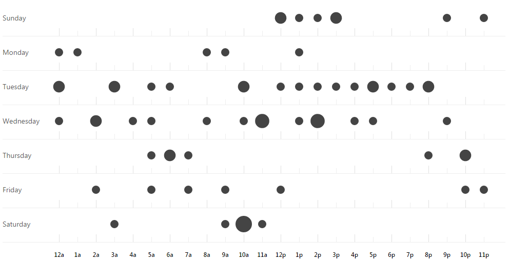
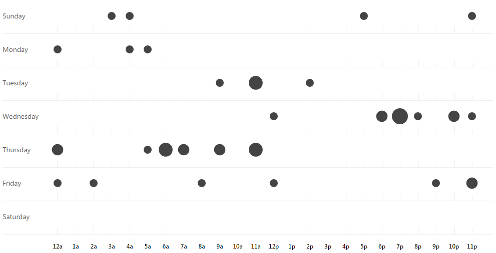
Below is the repository activity for both 'masters-source' and 'masters-docs'. 'masters-early' was used earlier on in the project but was replaced by these two repositories as the project progressed.
Masters-source
The repository containing the source code for the application.
Contributions

Punchcard
Masters-docs
The repository containing the documentation for the project.
Contributions

Punchcard
Timeline Estimate Vs Actual
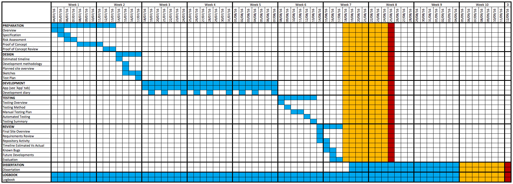
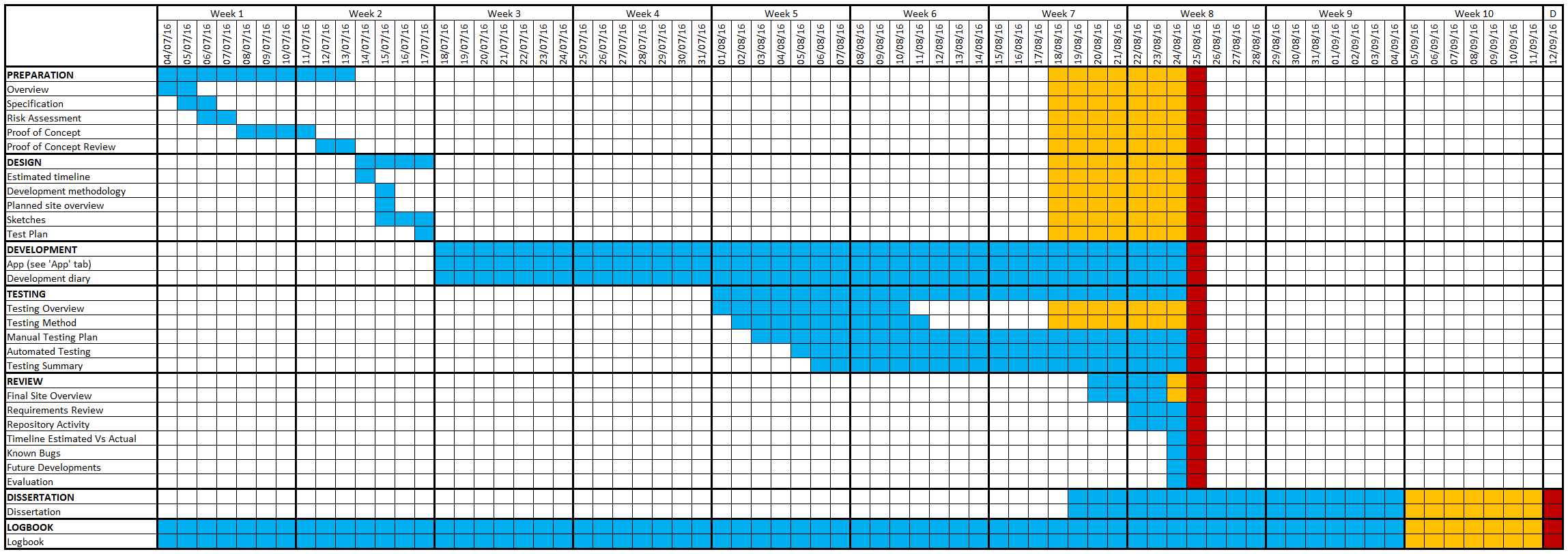
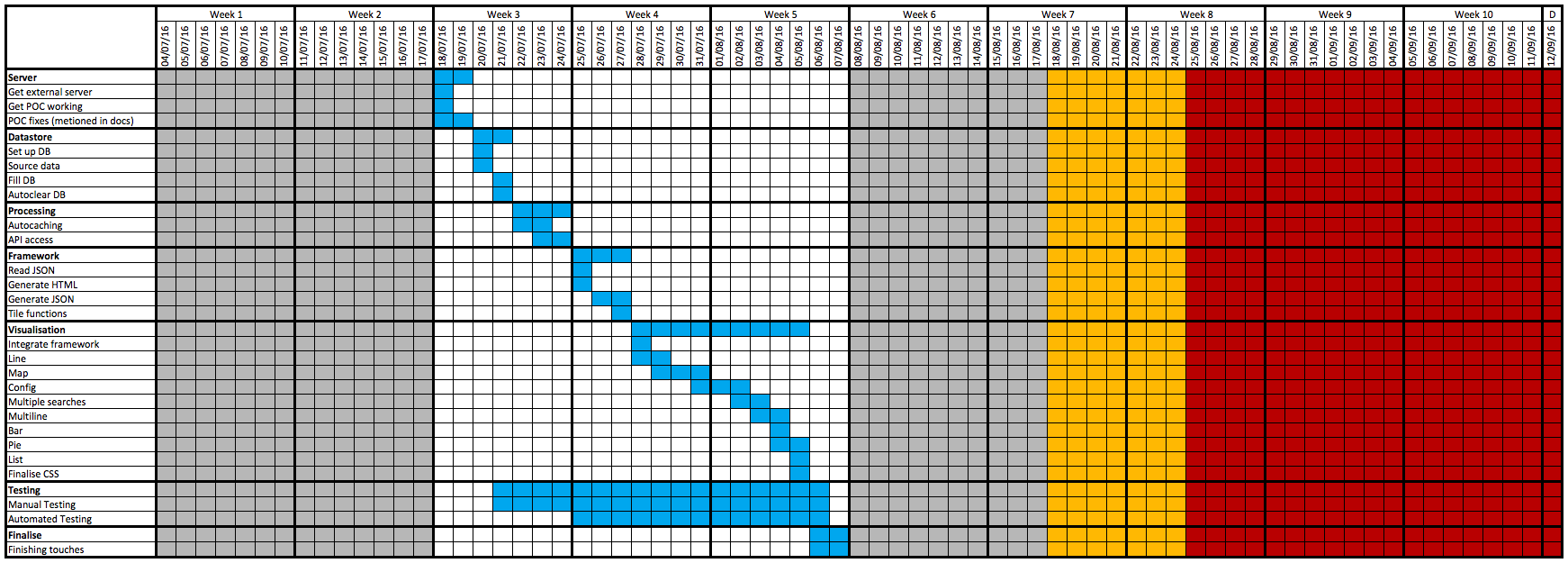
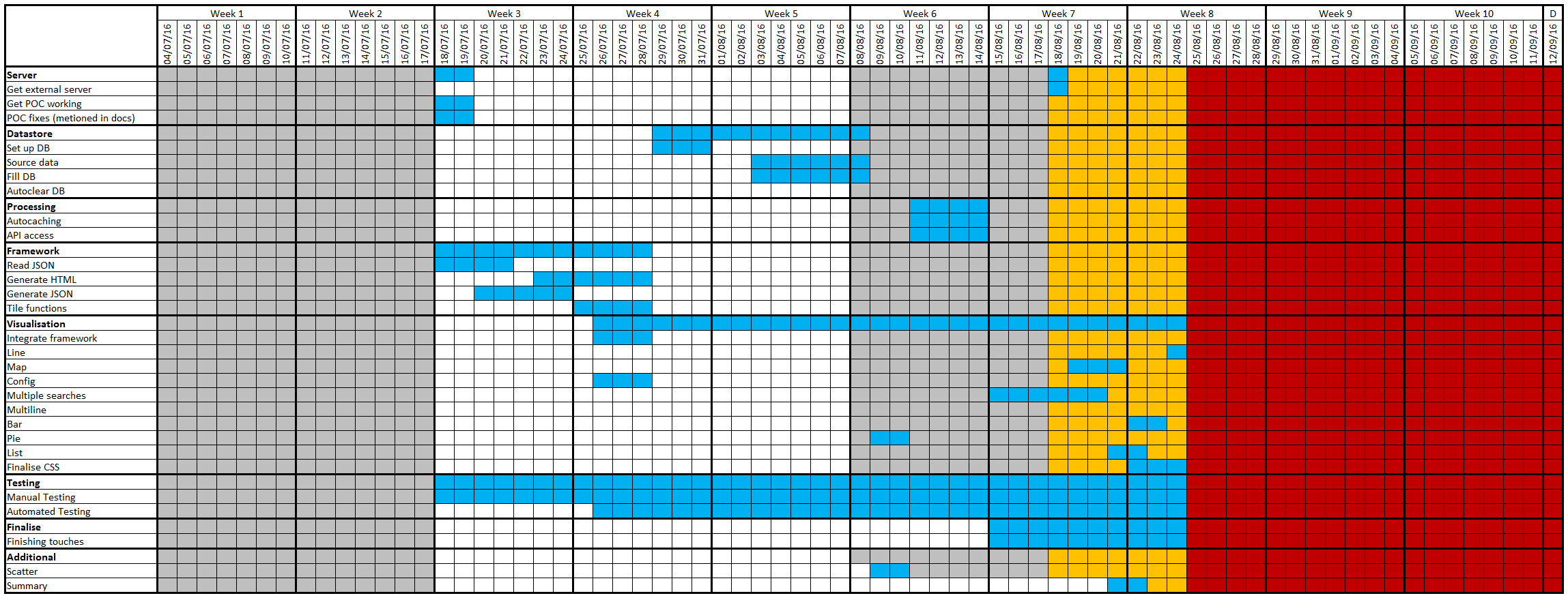
Due to this being a solo project and encountering a number of issues during the development, once development began the plan was not always strictly followed. When issues that needed fixing arose I had to break from the plan and fix them. Although the application development took longer than expected, the overall results of the development are good.
Gantt chart timeline - project
Estimated:
Actual:
Gantt chart timeline - app
Estimated:
Actual:
Known Bugs
There are a few issues with the application in its current state.
-
Firstly, the line graph has one data point for each second within the specified duration. At anything more than a 5 minute duration this not only looks ineffective but due to all the data points it could slow down the other visualisations depending on the device it is running on.
-
When saving a JSON configuration on the settings page, the status message that would indicate that the configuration saved successfully is overwritten after the application checks if the JSON it is loading into the settings page is valid.
-
There is no notification to specify that the search term has been changed. If the search term is changed and the user does not have the 'summary' pane open, they will not see what the new search term is.
-
The search term is saved on the server and is the same for every instance of the application that is running. If a different user changes the search term it is not handled as gracefully as it could be.
Future Developments
Due to the plug and play nature of the project, it would be fairly simple to extend or expand this application. The best future developments for this project would be:
-
User specific search terms and configurations - Currently only one search term and one configuration is available for anyone accessing the application. Individual display settings would drastically improve the usability of this application.
-
More visualisations - There is a vast amount of data provided by Twitter, therefore there are many more visualisations that could be produced.
-
Store multiple configurations - It would be very useful to be able to switch between different configurations with them stored within the application.
-
Different application source data - Instead of following a specific filter it would very interesting to follow a specific tweet or user to watch the interactions more closely.
Evaluation
Overall I would have to class this project as a success. The application that has been produced looks very professional, is stable and only has a few minor issues that could be fixed in the future. The project as a whole has met all but a couple of the requirements that were specified in the 'Preparation' section of the documentation and I believe fulfils all of the aims that were specified at the beginning. Raven is an aesthetically pleasing application that is able to provide useful information whilst also being highly customisable.